
Since it was launched in 2015, the Air Quality Index (AQI) has been widely used in reporting and discussing air quality in India.
There are multiple apps and websites that can be accessed to find out the air pollution levels, almost always in AQI terms.
However, there are often discrepancies between the numbers reported in these different sources leading to added confusion to an already complex issue.
This article tries to address some common questions and misconceptions about the AQI.
Why Do We Use AQI?
The AQI was created to help communicate the severity of air quality levels for multiple pollutants to the public, the risks they carry and recommended defensive measures through a single composite index, a colour-code and broad categories of air quality levels (good, moderate, poor, etc.).
How Is The AQI Calculated?
To determine air quality in an area, pollutant concentrations are physically measured and reported. The AQI is calculated based on the average concentration of a particular pollutant measured over a standard time interval (24 hours for most pollutants, 8 hours for carbon monoxide and ozone). For example, the AQI for PM2.5 is based on 24-hour average concentration and computed as shown in the table below.

As the table shows, the AQI for PM2.5 is in the ‘good’ category (0-50) if the 24-hour average is within 0-30 microgram/m3; e.g. if the 24-hour average concentration is 15 microgram/m3, the corresponding AQI is 25.
It is severe (400+) if 24-hour averages are greater than 250 microgram/m3, and if concentrations are 380 microgram/m3 or more, they get reported as 500, the maximum possible.
In a similar manner, the AQI is calculated separately for each of several pollutants.
In India, AQI calculations include the eight pollutants for which National Ambient Air Quality Standards (NAAQS) have been set.
These are PM10, PM2.5, nitrogen dioxide, sulphur dioxide, carbon monoxide, ground-level ozone, ammonia, and lead.
However, all of the pollutants are not measured at every location.
Here is a short summary of the air pollutants and AQI categories.
The final AQI is equal to the highest of the AQI values calculated separately for each pollutant, and the corresponding pollutant is also reported.
For example, if the individual pollutant index for PM2.5 is 90, nitrogen dioxide is 45 and ozone is 65, then the AQI will be 90, the value of the index for PM2.5.
If a city has multiple monitors, the average across the city is used and reported in CPCB’s AQI bulletin (see figure 1 below).
The website and app report individual locations too.

Note that the prominent pollutant can vary from city to city. In most cases, though, concentrations of PM2.5 drive the AQI values in Indian cities.
Why Do Some Monitors Say Us AQI? How Is It Different from CPCB’s AQI Index?
Each country calculates AQI based on their national air quality standards, and the terminology used to describe the bands (or breakpoints) also varies.
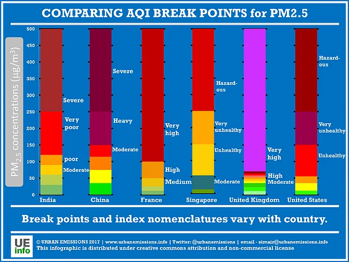
Official Indian agencies and their apps (Sameer, SAFAR) follow the Indian AQI system.
The popular AQICN website and its associated ‘Air Quality’ app follow the US AQI system. Furthermore the AQI shown in these websites refer to different, but related, statistics.
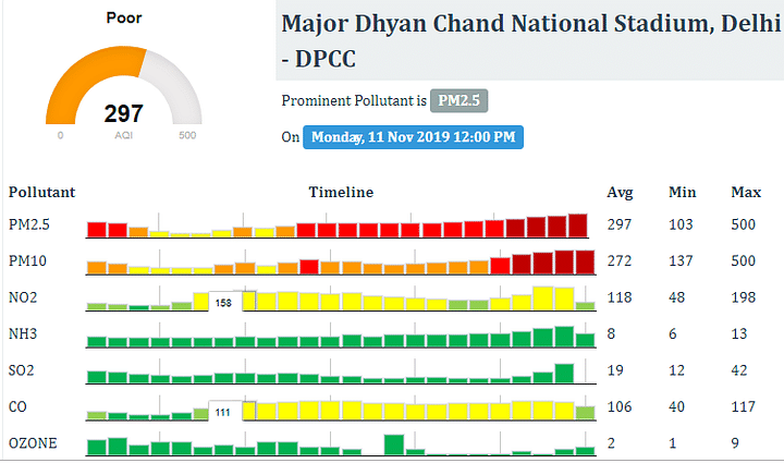
We illustrate by comparing CPCB’s Sameer app with the popular international Air Quality app below for the same monitor (Major Dhyan Chand National Stadium located near India Gate in New Delhi), at the same time (12am on 11 November).
The Sameer app and its corresponding website, following the CPCB process, report a 24-hour average. For example, in the figure 3 below, the AQI reading is 298 (“Poor”) with the prominent pollutant as PM2.5.
This reflects the average over the 24 hours preceding the time when we visited the site. The AQI value at the time (the last red bar in the PM2.5 row) is 312. (You can read the individual values if you hover over the bars in the website.)
This reflects a PM2.5 concentration of about 135 microgram/m3.
The Air Quality app and its corresponding website report the US AQI equivalent of the concentration at the time. So, for the same hour and monitor, Figure 4 reports 193 (“Unhealthy”, from the US system) reflecting the same concentration of about 135 microgram/m3 (you can convert here).

The SAFAR app reports AQI values for the monitors maintained by the Indian Meteorological Department.
Data from these monitors are also reported on the Sameer app, but the AQI levels differ.
This is because SAFAR reports the Indian AQI equivalent of the air quality at the time, unlike Sameer that reports the average over the previous 24 hours as we have already discussed.
Finally, there are many other apps and web portals, andeach may report related but somewhat distinct figures.
This is confusing! How can we avoid these inconsistencies?
For media outlets in India, we would recommend reporting AQI from CPCB’s Sameer app or website for consistency. If you are a general user who wants to know how polluted the area is, please make sure you understand what you are looking for from these apps, and what the number on the app/website represents.
A good first step is for each of these apps and portals to have a clear description of the source of the data, and how the number being displayed was calculated.
Like many of our colleagues, we ourselves rarely use the AQI and instead, prefer to track the concentrations of PM2.5 and other pollutants (available at another CPCB website).
Just like we can easily interpret whether a temperature is hot or cold, one could interpret the concentration as high or low by comparing the levels to the national and WHO standards.
Is It True That CPCB’s AQI Index Caps at 500? Also at the Peak, Most Monitors Show 999. Do They Cap off at 999? Some Now Will Show More Than 999. Which Is Correct?
The Indian AQI is capped at 500. For PM2.5 this corresponds to a pollution level of 380 microgram/m3— a level that is unfortunately not unusual in India.
From CPCB’s AQI website, it appears that CPCB calculates the AQI-equivalent for hourly concentrations, and reports the running average of these values for the previous 24 hours on its website, and Sameer app.
The problem with capping at 500 is that there is no way of communicating through the AQI that pollution may be at even more severe levels.
In addition, the 24-hour average too gets underestimated because we are artificially placing a cap at 500 for individual hours.
The CPCB calculation method is worth a relook given that concentrations often breach the 500 AQI level. In fact, the Graded Response Action Plan (GRAP) for Delhi NCR specifically includes a ‘Severe Plus’ category when AQI is expected to exceed 500, when certain emergency measures are supposed to be implemented.
In case of the US AQI, values above 500 are considered Beyond the AQI and people are advised to reduce their exposures and keep activity levels low.
Fun fact: Back in November 2010, when the US AQI value went beyond 500 in Beijing, the US Embassy’s Twitter post not only made headlines, but contributed to public outrage and contributed to efforts on air pollution control over time. We seem to be more patient, unfortunately.
The 999 AQI seems to be a feature of the popular AQICN website or Air Quality app. As best as we can say, there is no particular reason they choose to stop there.
The AQI’s calculation method is driven by convention. There is no reason why it needs to be capped at 500 or 999 or any other number— it is just an agreed method.
Again, using PM2.5 concentrations instead of AQI could avoid these confusions. (If it was not clear already, we are not big fans of the AQI.)
Which of These Pollutants Is Considered Most Dangerous?
In scientific literature, strongest health evidence is available for PM2.5; many studies from around the world have shown that PM2.5 is linked to a variety of health impacts including lung and heart diseases, diabetes, stroke, lung cancer and other illnesses.
Rejoicing When AQI Falls to 250 from 999 – Should We?
No, there is no reason to cheer unless the AQI reaches the green band. In fact, it is important that we don’t let the spikes during the heavy smog episodes bias our idea of what clean air is. An AQI of 250 is still very polluted air (infact, even 150 is bad!), and one needs to take appropriate precautions while venturing out.
Heard in an Elevator: Indians Are Not Affected by AQI of 200-300, Our Immunity Is Stronger. Is This True?
No, not really. We do not become immune to air pollution. Studies around the world have shown evidence for a variety of health effects including lung and heart disease, stroke, diabetes and other illnesses. In fact, recent studies in North America indicate health effects even at low levels of air pollution.
Reach out to us if you have more questions!
(Santosh (@santoshharish1) is a Fellow at the Centre for Policy Research, New Delhi. Pallavi (@pallavipnt) is an air quality scientist, who works at the Health Effects Institute, Boston and runs the Air Quality in India platform.)
(Delhi is in a public health emergency and schools have been shut. The air outside is visibly toxic - how has the hazardous air #pollution impacted you? Write down your #PollutionKaSolution and send it to us at FIT@thequint.com. )
(At The Quint, we are answerable only to our audience. Play an active role in shaping our journalism by becoming a member. Because the truth is worth it.)